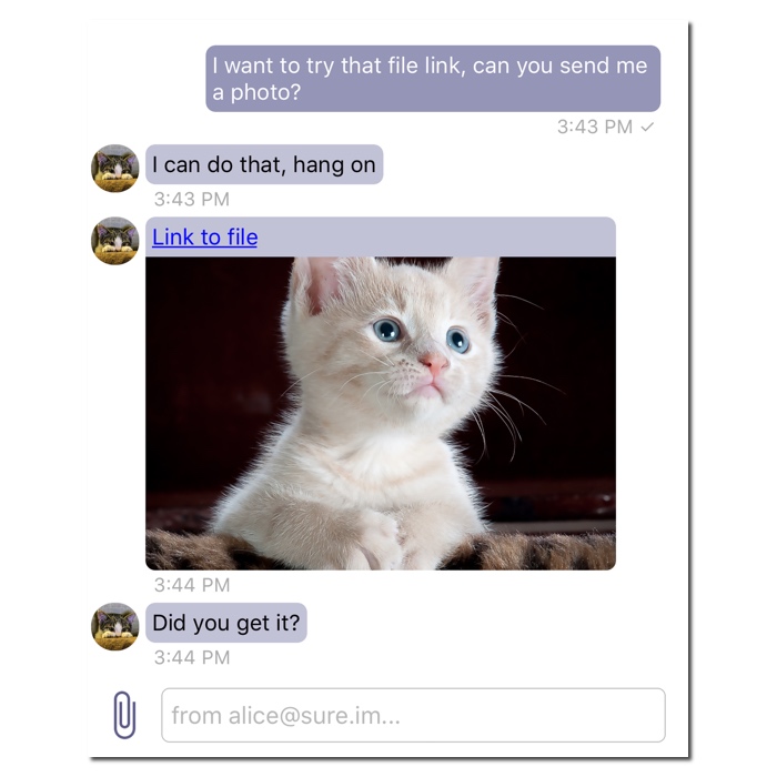
-
This app by design is presenting list of message without bubble aligned to the left or to the right. There are no bubbles moved to the left or to the right, so you can see the actual message sent and easily read messages instead of jumping with your eyesight to left or to right depending on who wrote a message.
-
This should be left open. This is how every other chat app functions, and people expect a certain consistency in their UX. I think if a user is providing feedback, it's counter-productive to reply "it's not the way you're saying you want it, because we think this is really what you want"
Not to mention, the media on the official website does show this left/right layout


Source: https://siskin.im/
-
This is how every other chat app functions
Not every chat app, ie. see Slack or Discord. Both of those services and their apps are chat apps and do not follow the approach you try to push.
But you are correct, we need to update screens on the web page (Thank you for reminding us about that!), but the screens in the AppStore (that you used to install the app) show correctly UI of the chat view.


Describe the bug A clear and concise description of what the bug is.
To Reproduce Steps to reproduce the behavior:
Expected behavior app is displaying messages for both sender and receiver on same side
Screenshots If applicable, add screenshots to help explain your problem.
Details (please complete the following information):
Additional context Add any other context about the problem here.